Interior Painting Colour Consultation: How to Choose Your Interior Paint Colour
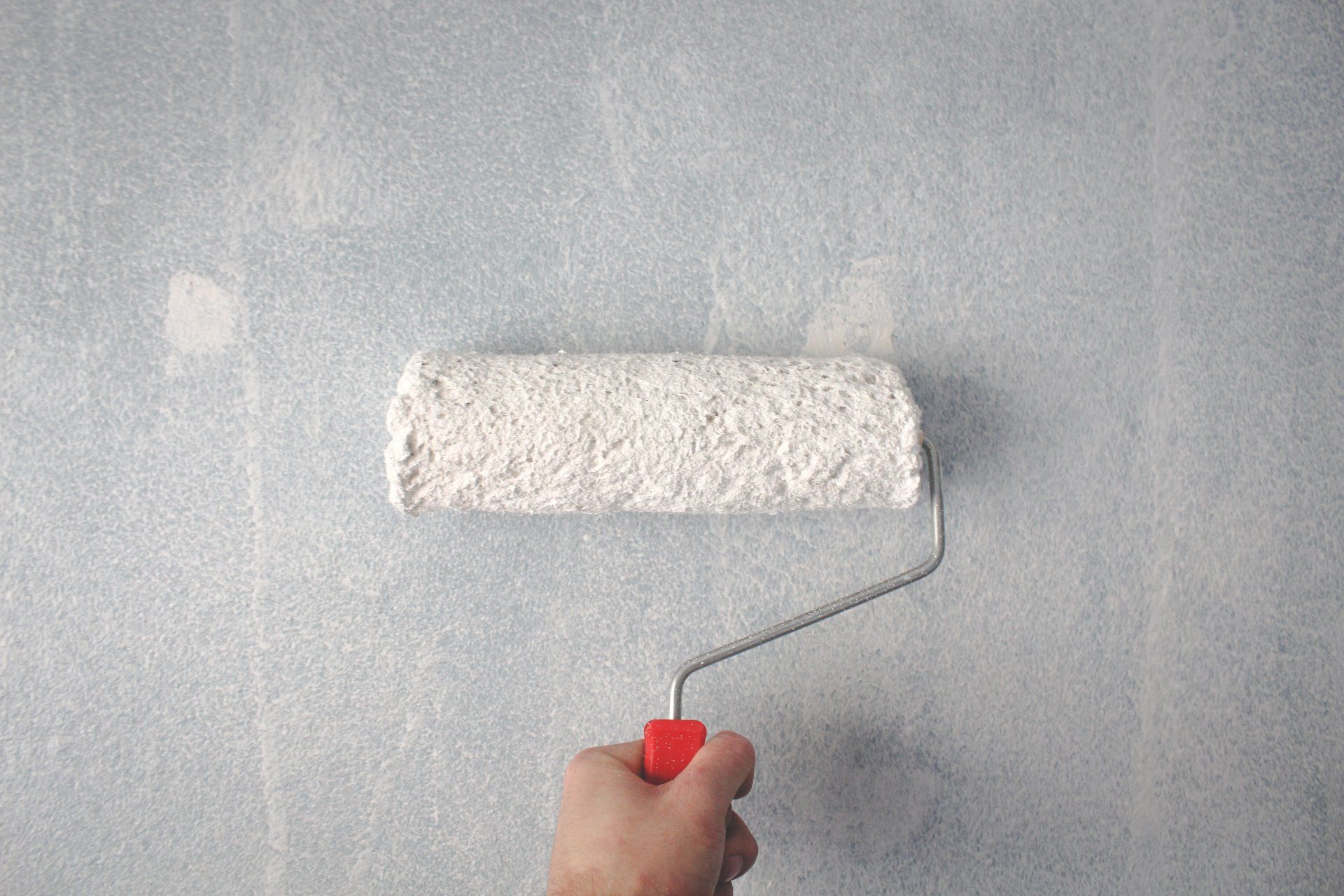
Interior painting is an easy and cost-effective way to give your house a breath of fresh air and make it more valuable if you plan to sell it.
In the modern open-plan houses, where kitchens, living rooms, and dining rooms are a single ample space, colour defines interiors and forms focal points in pretty featureless rooms. The challenging part, of course, is choosing your interior paint colour for use and where to put them. Learn how to choose your interior paint colour in this post.
How to Choose Your Interior Paint Colours
Create a Colour Scheme that Aligns with Your Home’s Furniture
In today’s interior painting world, where you can purchase various colours below $20 per gallon, it is vital to consider the advice of architectural colour designer Bonnie Krims. “Always remember that while there are thousands of paint chips at the store, there are only seven colours in the paint spectrum – red, orange, yellow, green, blue, indigo, and violet. I always suggest eliminating a couple even before you go to the paint store.” Here is Krims’ 4-step method of creating a colour scheme:
Begin by choosing three colours from common objects in your home, like furniture, and carry it to the paint store. Choose three sample strips containing those colours, and you will have almost 18 colours to use, as every sample strip usually has six paint colours.
Next, select one of the three paint colours as your wall colour and space the other two for furnishings or fabric.
Thirdly, select the neighbouring rooms’ colours – choose a different colour from your initial sample strips.
Lastly, select a fourth colour that you can use as an accent.
2. Decide on the Finish to Create an Appealing Visual Impact
Once you have chosen your colours, think about the finish you will use. While today’s flat paints have high stain resistance, a satin finish is perfect for walls since it is easily scrubbable and rarely draws attention to defects. Semi-gloss and high-gloss finishes were best left to the trim, where they perfectly accent the curves of a molding profile.
However, in the modern painting world, you can also apply finishes to generate visual effects on the whole wall. For example, you can paint one wall in a flat finish and the adjacent wall in a semi-gloss, both in the same colour.
3. Match the Colour to Your Favourite Feeling
Generally, it would be best to paint your social rooms (dining rooms, kitchens, family, and living rooms) with warm colours, such as coral, cranberry, etc. For individual rooms (home offices, powder rooms, bedrooms), use cooler hues, such as sage-green, violet, etc.
Paint your study rooms yellow as it stimulates the brain. Colour your dining room red as it increases appetite and blood pressure. Lastly, paint children’s bedrooms purple as they love it more than any other colour.
4. Know Your Whites
There are multiple types of whites. Pure, “clean” whites lack tinted undertones. They are loved by designers striving to showcase their artwork and are often applied on ceilings to form a neutral field overhead.
The other ordinary whites are either warm – with yellow, rust, pink, or brownish undertones – or cool, with green, blue, or gray undertones. It will help if you use warmer whites in rooms with inadequate natural light to give bigger spaces a cozier look. Contrary, cool whites help to open up spaces. You should test them simultaneously to see which one suits well with the other room colours.
Interior Painting Colour Consultations in Edmonton, AB, Canada
In the field of interior painting, one company stands tall, ready to offer you professional consultations you can trust! MB Painting offers superior interior painting services in Edmonton and takes an interest in your home colour choices.
Are you ready to commit yourself and give a breath of fresh air to your interior rooms? Ensure you know your options by reaching out to us for professional interior painting consultation and services.